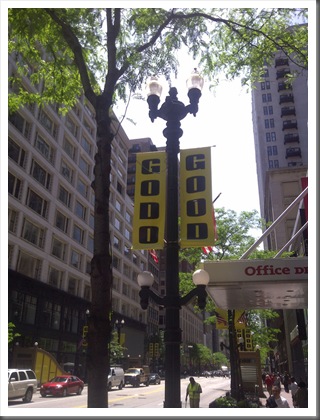
So, these signs have popped up all over State street in Chicago. I, more than most, appreciate a good does of word play and a creative font. But I think they might have gone a bit too far.
GODO GOOD.
If took me a few seconds to realize that it wasn't "GOOD GOOD" but "GO DO GOOD".
So, who is urging us to action?
What group is trying to stir our civicmindedness?
A religious organization?
The Boy Scouts.
Those hippies that are always on us about trees and whales and dolphins?
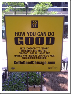
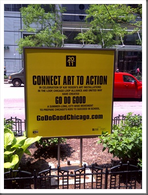
Nope, GoDoGoodChicago.com it's an art installation to help raise money to prepare Chicago's school children to succeed.
Want the kids to succeed? Here's a crazy thought. Chicago already has about the shortest school day in the year (8:50 – 2:45), and now they want to take another 10 minutes at the start of the school day to serve breakfast.


3 comments:
When I first saw it I thought it said "Gooo Gooo". Not really the best font for an advertising campaign!
I kept reading it "Go Do God" for some reason. Not the worst message ever but still...
In our town we have "HUBBA" it's a whole movement thing that stands for "Helping Us Build Better Assets" And other than the party at the end of the day, I'm not really sure what it does, but there IS a tee shirt involved, so it must be good!
I must need more caffeine because when you revealed "Go Do" I still read it as if it rhymed with "Dodo" like the bird. Oy...
Post a Comment